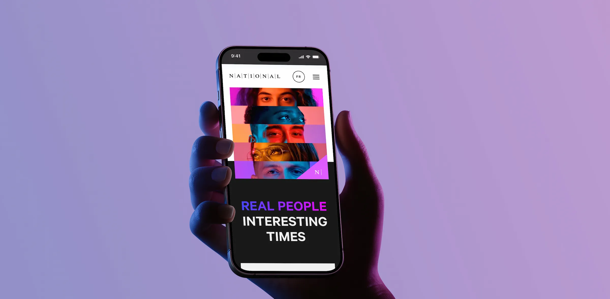
/ Homepage video
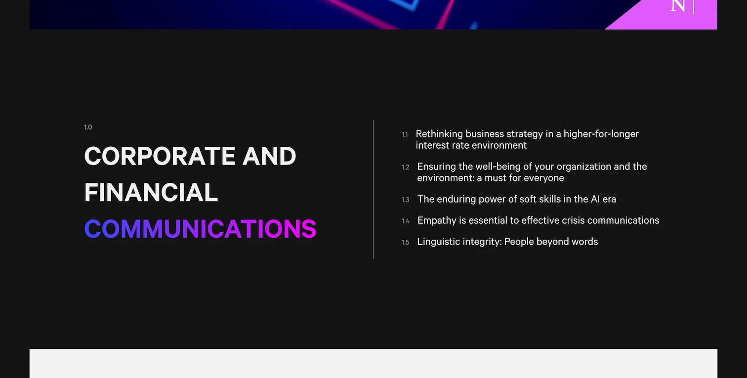
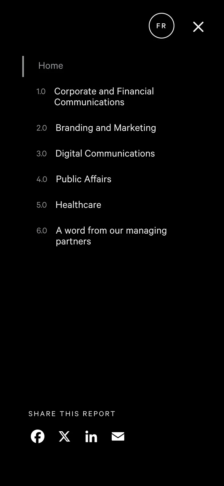
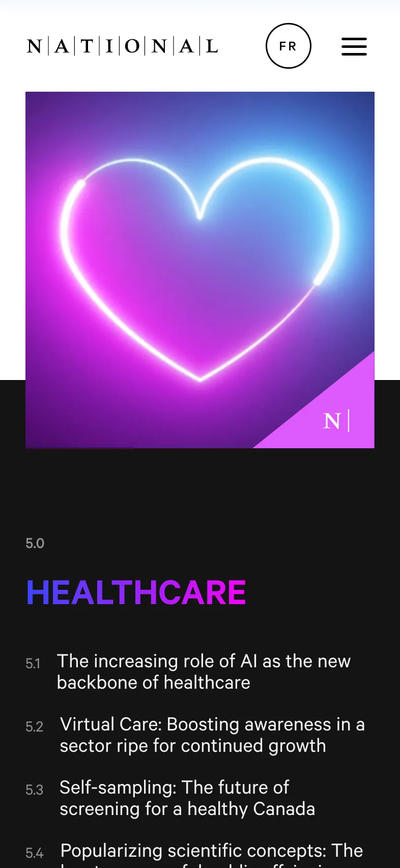
Introduce a numbered table of contents to improve scanability and in-page navigation.
/ Corporate and Financial Communications
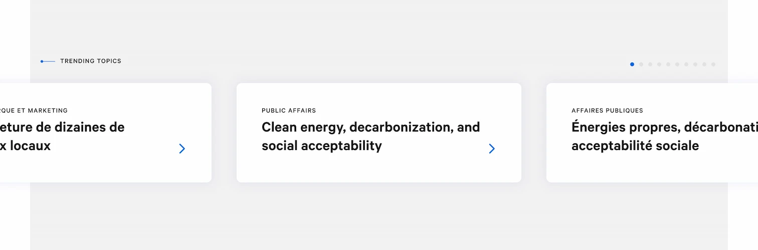
Surface high-interest stories through a “Trending Topics” carousel to guide users into the report.
/ Homepage
/ Adaptive design

Before
After
Design Rationale & Key Decisions
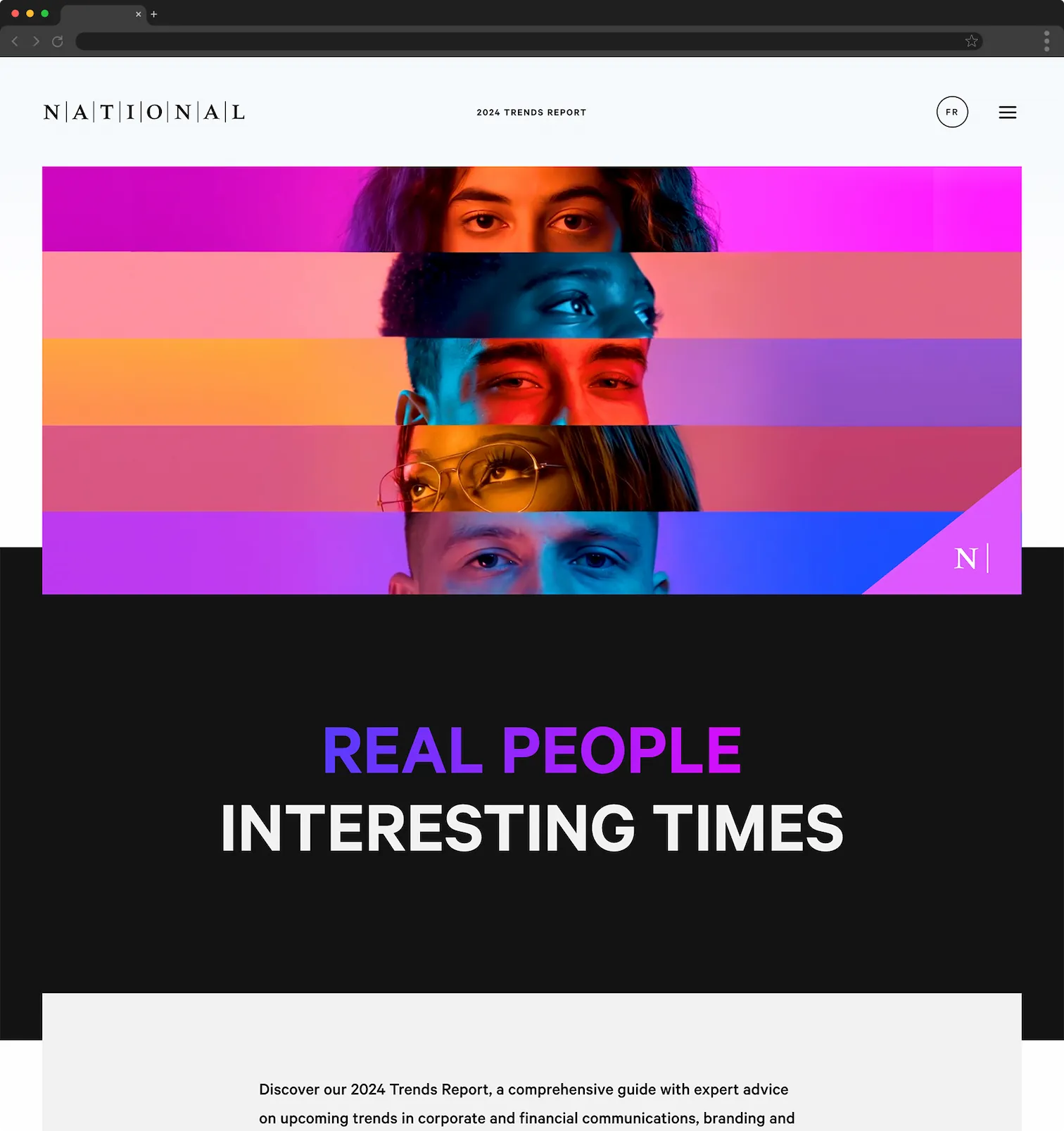
01. Use trending content to pull users deeper into the report
Analytics showed that many visitors were not moving beyond the landing page. To encourage exploration, we introduced a “Trending Topics” carousel on the homepage that surfaces high-interest stories and gives users clear entry points into the report, helping extend session depth and overall readership.
02. Make long category pages scannable and easy to navigate
Each category page contained a large volume of content, making it difficult to quickly understand what was available. We added a numerical table of contents near the top of each page, allowing users to see the full scope of topics at a glance and jump directly to the sections most relevant to them.
03. Balance brand consistency with a distinct visual identity
While the microsite needed to remain aligned with the NATIONAL brand, it also required its own visual character. We retained the core brand fonts and color palette, and introduced a complementary gradient system that added depth and energy while supporting the report's thematic visuals.